Redefining the signature
Docusign
Brief
DocuSign asked Active Ingredients to lead a series of strategic website initiatives to help the brand better connect with its diverse audiences. We got to work finding ways to guide each visitor segment — from individuals to global enterprises — through a far more effective learning process designed to convert.
Brand and digital strategy
Design
Copywriting
SEO
Making DocuSign irresistible… to everyone.
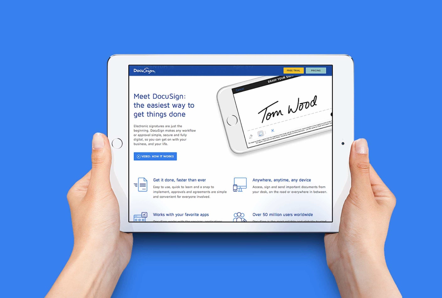
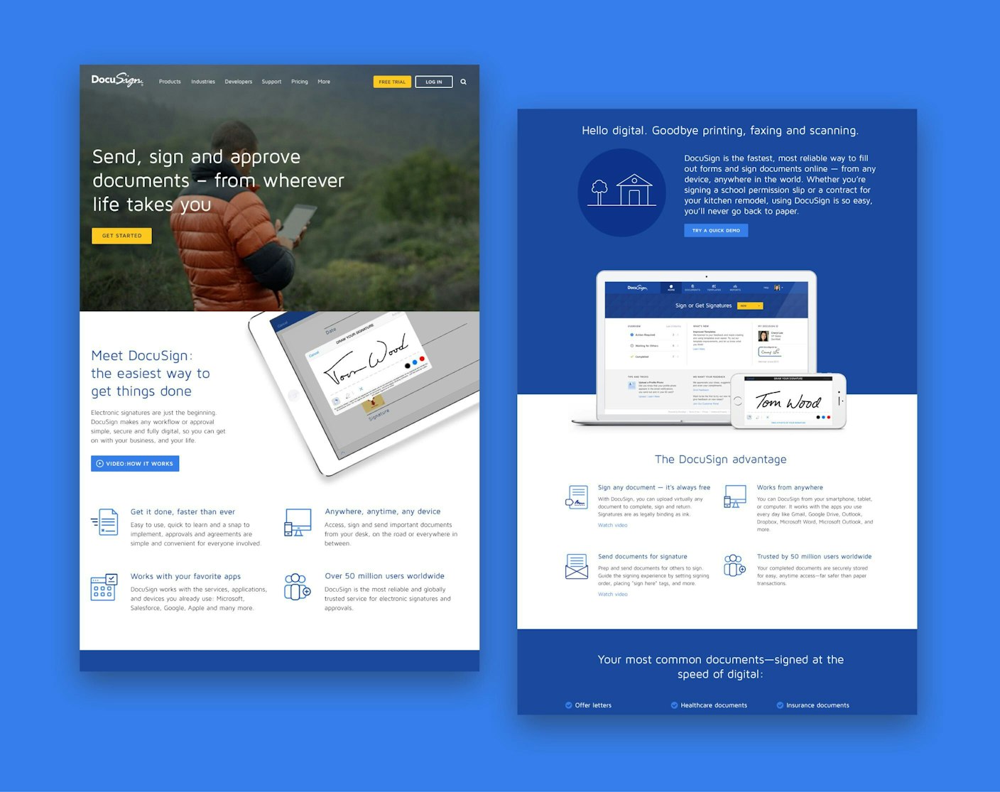
Customers love DocuSign, but the company needed a better way to help buyers quickly understand how its electronic signature software can make their businesses (and lives) easier to run than any alternative.
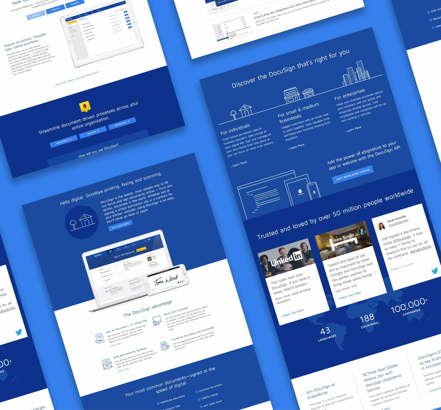
A revitalized homepage and new product pages offer a smarter product learning flow tailored to DocuSign’s distinct audiences, making its value immediately tangible and relevant.
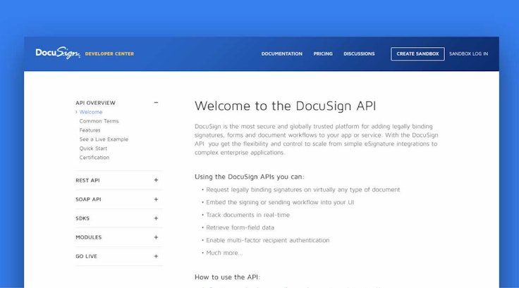
A new homebase for developers
Getting developers to embrace DocuSign’s API as the “go to” eSignature standard for app development is mission #1 for DocuSign’s Developer Center. The old site was complicated, making it hard to get started. The new experience put developers front and center. It was suddenly easy to understand the platform and find relevant documentation and resources so developers get results faster. Happier developers = healthier platform.


“Great talent all around, super dedication, and a true pleasure to work with. It really does feel like we’re on the same team.”

