Build Less, Make Better Things
By Eric Eisenberg
May 7, 2021
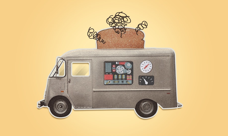
I need a new toaster, so early this morning I scrolled down a webpage to begin my research.
I was heading for a link on the right side of the screen when an accidental trackpad double-tap abruptly zoomed me toward a $600 blender. Impact with smoothie narrowly averted, I pulled back out, but somehow triggered an overlay asking me to provide website feedback. Attempting to X-out, I missed by a few pixels and hit a link to another page altogether.
I couldn’t hack it anymore, and command-Q’d. Way too much going on before the coffee’s even brewed.
Actually, it’s way too much, period.
We are besieged, constantly, by functionality. So much so, that the experience of interacting with devices of all kinds has become a balancing act for the user: We enjoy and benefit from the technologies that serve us, but must simultaneously live with — and learn to avoid — the unwanted features that come along for the ride. Even my laptop trackpad has a host of preferences, such as the double-tap feature that launched me into this morning’s sequence of befuddlement.
This wasn’t always the case.
In less connected times (think pre-Internet), devices were typically built with fewer features. Try to observe a 70-year old as they navigate any contemporary technological process for the first time. Watch them pair their phone with the car Bluetooth. Or work from a shared Google Doc. Or design their Bitmoji avatar. The scene will generally ride the edge between partial-comprehension and absolute confusion. Try it on your parents — you’ll actually see their lips form the W that generally precedes the TF.
“When an experience is packed with too many features, its very benefit to the consumer is compromised. A tool is not valuable simply because it can do a lot of things.”
Like I said, I need a new toaster. Mine is burning unevenly. I’ve had this one for about 10 years, so I felt a pang of consumer excitement about a shiny upgrade. In the appliance aisle of the kitchenware store, marveling at a decade worth of feature-evolution, I picture myself harnessing 1800 watts of power to crisp up my English muffin. Or having fun experimenting with convection-toasting my bread instead of regular-toasting it. Some of these contraptions have Buck Rogers-style control panels that would surely rock my sourdough.
While I was pushing buttons just to feel the action, the fridge next to me started talking. I could customize my very own water filling preferences. Impressive. I bet it even has an option to share how much water I’m drinking with my friends. If not, I’m sure next year’s model will.
Oh, what to do?
I have a toaster decision to make. This spanky stainless steel number over here looks pro-grade, but the owner’s manual is massive, and I have other reading I want to do. But wow — I could roast a whole chicken. In my toaster.
Or, I could go for this $450 “classic” model. It’s really just a retrofied version of my parents’ old toaster. You push down the lever and it toasts. It’s simple, and I like that. But it would have to burn through 160 loaves of bread to pay for itself.
So I did the most important thing a consumer could do at this point: I left.
And I thought about it.
And this is what struck me.
When an experience is packed with too many features, its very benefit to the consumer is compromised. A tool is not valuable simply because it can do a lot of things. Feature-flexibility may make a device more relevant to more people, but its core usefulness is diluted. It adds complexity for the user, it’s a burden to interact with, and it’s more prone to malfunction.
The talking fridge was cool, but it would require work to learn how to avoid the multitude of features I don’t need. I can’t think of a person who wouldn’t prefer to be able to just walk up to a fridge and push their glass against the lever for water, as opposed to navigating through touch-screen options to identify themselves in order to receive a preset pour according to their personalized preferences. Now, if it can mix me a gin & tonic, game on, but in the meantime, I don’t want a refrigerator with a learning curve.
Same goes for my toaster, which, for my needs, exists to toast bread and English muffins. And maybe reheat pizza or frozen waffles. I’m not going to roast a chicken in my toaster. I thought that’s what my regular oven was for. I’m either confused, or I’m beginning my slow-slide into the older generation.
Maybe part of this is that older generations will never be securely accustomed to systems of newer generations’ innovation. But in defense of the older, today’s products and services are too often burdened with over-functionality. We’re building things out of balance. And when we do, it’s not our parents’ fault that they’re not getting it. It’s ours.
Which begs the question…
How, then, do we build everyday devices, appliances, and technologies that can accommodate a colossal variety of users? Like a web browser. Or a car dashboard. Or a toaster.
The more people a tool needs to serve, the simpler it needs to feel. Rather than offer features and options to satisfy limitless preference variations, it should masterfully execute the most common actions as its primary function. Sure, optional features can benefit different users, but they should never present hurdles for interacting with the core functionality.
For this reason, I believe that simplicity in design will dictate what products go the long haul. Designers should always question whether offering fewer options might better serve their users. Success here will come down to the most critical task for creators: the willingness to edit.
Simplicity, in and of itself, is one of the most rewarding forms of interaction we can create for our users. And creating simplicity (i.e. editing) often requires deep, critical thinking.
“Perfection is achieved, not when there is nothing more to add, but when there is nothing left to take away.”
Epilogue
After taking mental notes at the appliance store, I returned home and called a friend to get his opinion on the toaster he just bought. I got his voicemail: “To leave a message, wait for the tone. To leave a callback number, press 5. To send a fax, press 7.
Then, after I left my message: If you are satisfied with your message, press 1. To erase and re-record your message, press 2. For a list of available commands, press 9.”
I sat through 27 seconds of options to leave a 7‑second message. Later, I found out he didn’t get a new toaster. It was a blender. The same model I crashed into this morning.
I suppose it’s in the realm of possibility that one day I’ll want my refrigerator to publish my thirst quenching conquests across social networks. I might even be compelled to compete with my friends to see who can stay most hydrated throughout the day. And maybe I’ll want my toaster to be able to detect bread type and cook it according to my preset preferences — and share each toast experience on Instagram if toast-posts start taking off. But I believe I never will, because those features are not, and will never be, useful. Strong statement, but I’m sticking to it.
I’m also sticking with the toaster I’ve got. It burns unevenly, but it’s my unevenly.


